I have already created and designed several spreads for the magazine Daphne's Diary. I also had to deal with the technical side of the layout, such as converting to CMYK, correct size for the images, baseline, making images freestanding, etc.
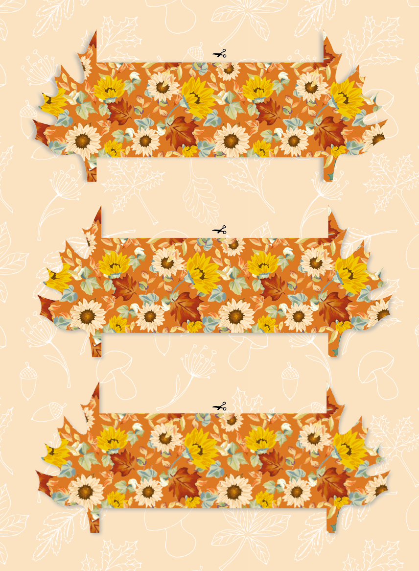
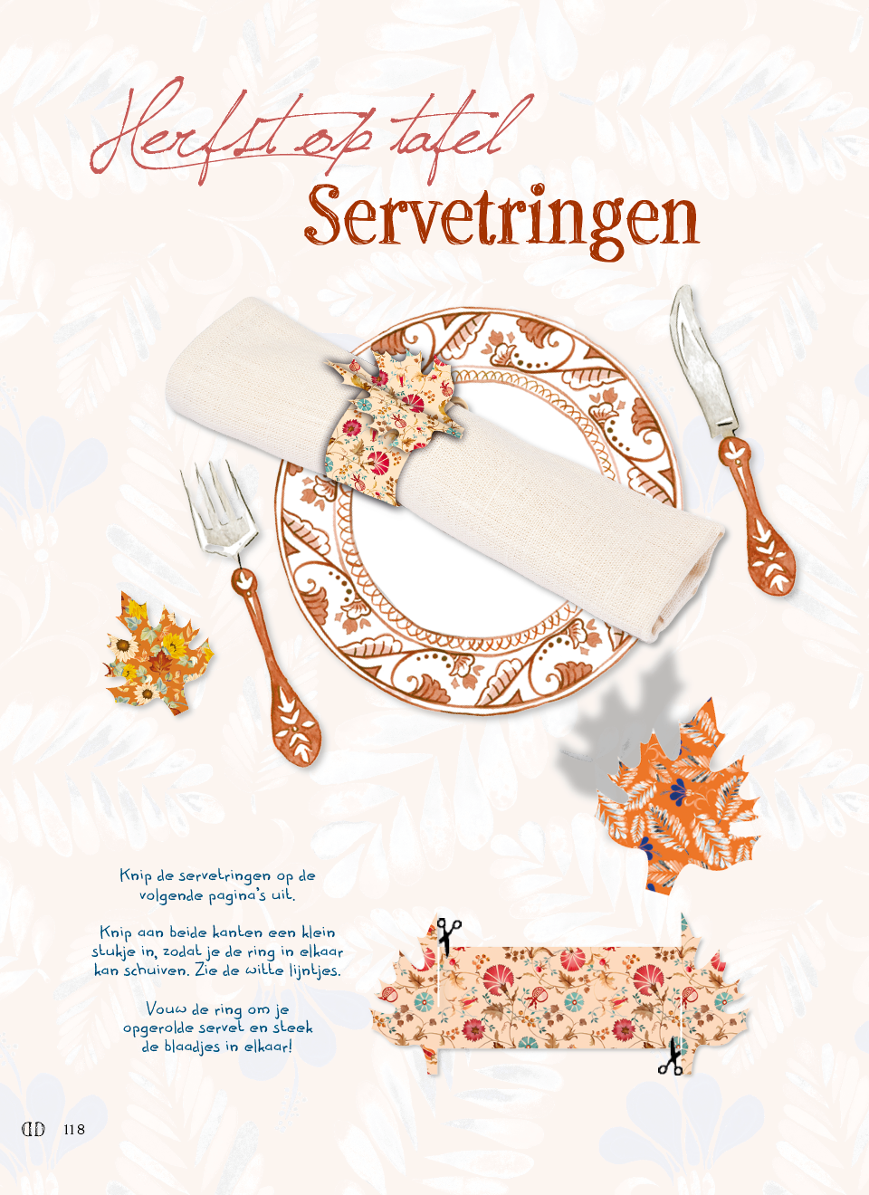
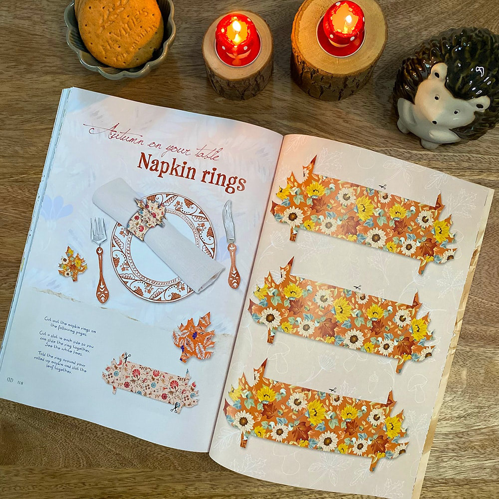
I also designed some posters and a DIY spread in the style of Daphne's Diary, with, for example, napkin rings for the autumn edition that you can cut and make yourself. You can see this at the bottom of this page.


For each issue a poster is made. The poster above with the animals and mushroom belongs to the autumn issue. Also a Do it yourself page is often designed and invented, for this autumn issue I designed a napkin ring.
Every now and then I go out myself to take pictures for an article. Like for this old-fashioned candy store in Alkmaar. I take the pictures, and edit them in Photoshop so that they have the right exposure. I design the article around it.
